-
Welcome to Tacoma World!
You are currently viewing as a guest! To get full-access, you need to register for a FREE account.
As a registered member, you’ll be able to:- Participate in all Tacoma discussion topics
- Communicate privately with other Tacoma owners from around the world
- Post your own photos in our Members Gallery
- Access all special features of the site
 New Homeowner Situation NEED ADVICE
 How do I store fuel can in the bed?
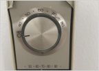 Anybody know anything about thermostats
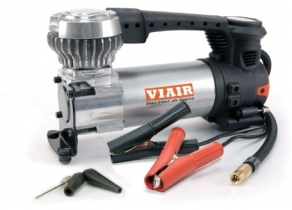
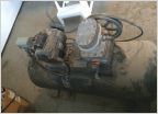 Picked up an old air compressor and need help
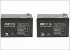 What batteries are compatible with this electric bike?
 Dog nail clipper recommendations
Thought this was cool!
Discussion in 'Off-Topic Discussion' started by BaywatchDV, Jun 4, 2019.